Facebook’s missing ads - a user-based solution?
|
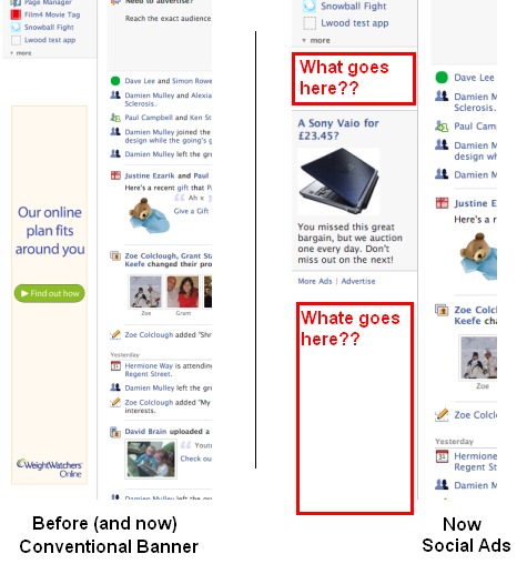
I think I am going to create a new category called "missing a trick", I seem to be posting a lot of stuff there are the moment, but I am not sure if I will be quite so up my arse in 2008 as I was in 2007 The problem I have noticed on Facebook that despite creating social ads (depending on which side of the fence you sit), they do not seem to have adjusted their left-hand banner sizes to suit. See the picture below:
As a marketer, I look at the left-hand banner and think "professional, looks fairly good, fits the allocated space and has a fairly visible call-to-action". I look on the right-hand side (of the above image) and ok, the "Sony Vaio for £23.45" is a dodgy-looking offer but it looks like a cheap, classified ad. There is a significant amount of white space that makes me think the advertiser is not capable of creating a professional-looking ad on the left - so why should I buy from them? Social ads only allow for a 110px x 80px ad so does that mean that as Facebook users we end up paying more than the big brands for less ad space? OK, you may rightly argue that the ad is centred vertically to the banner, but how shoddy does THAT look? The solution I see it being two-fold:
OK, so it may be a mad-cap scheme full of holes and the current ad system is already pants, so why ad complexity that is simply not up to the job anyway, but more than anything - this allows the community to connect with itself to make money for itself using Facebook. Technorati Tags: facebook,social ads,banner,banner ads,ppc,ads
|